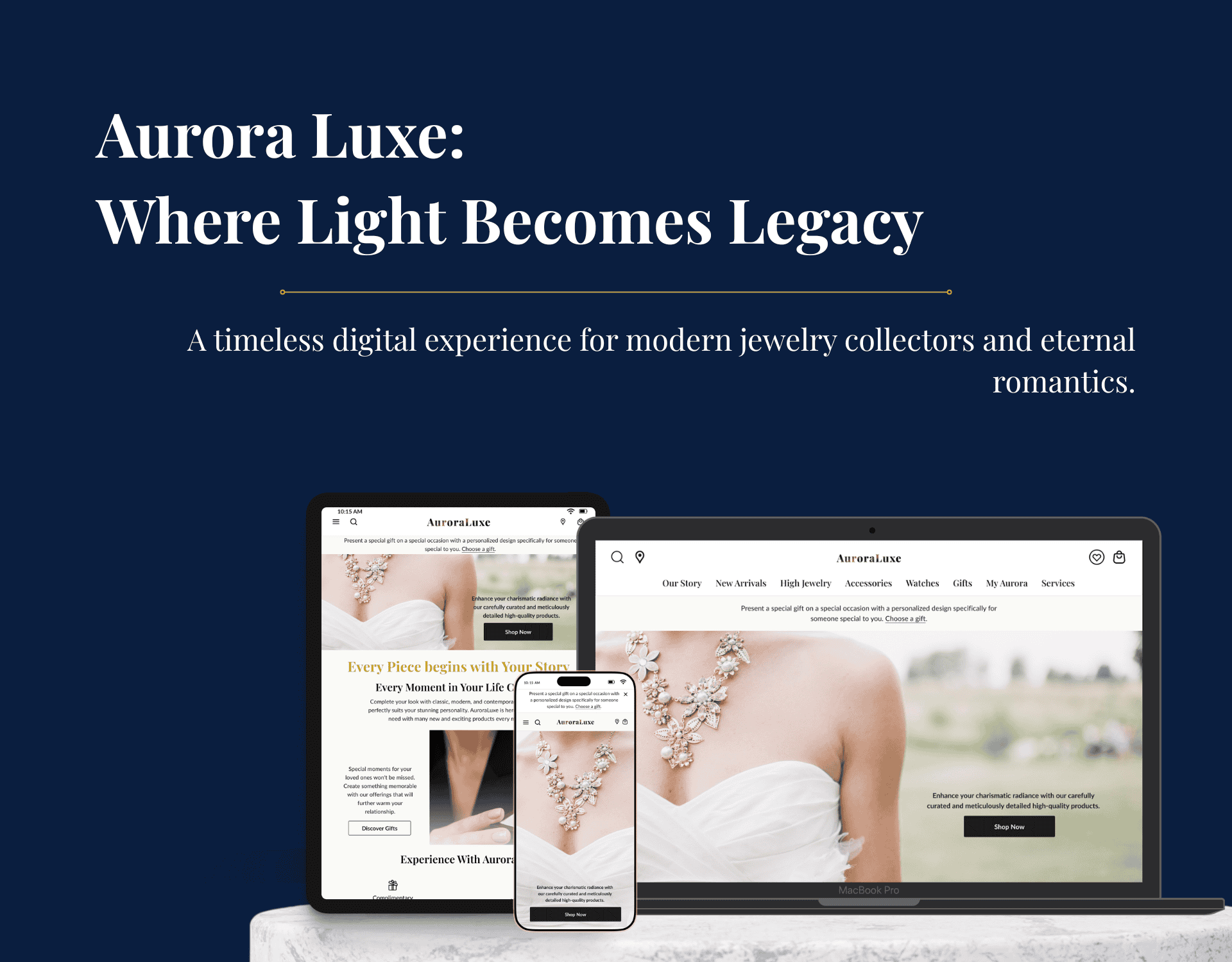
Many people who like to collect luxury items, or those who like to give their loved ones something rare and have premium value, are the most suitable ones for AuroraLuxe. As a conceptual project, I tried to create designs with a premium vibe.
This project specialized in UX design and used a design thinking approach. From the empathizing phase until the usability testing phase, this project demonstrated how I emphasized the UX design process for a luxury brand website.
Overview
AuroraLuxe is a luxury jewelry brand that blends timeless elegance with a modern digital experience. Inspired by the depth of Harry Winston’s story, the emotional elegance of Cartier, the refined simplicity of Tiffany & Co., and the approachability of Swarovski, AuroraLuxe aims to create a luxury brand presence in the digital world that feels exclusive, emotional, deeply personal, and easy to navigate.
The project focused on designing a sophisticated e-commerce website experience that primarily guides users in discovering luxury jewelry as a symbol of success, personal identity, and prestige, and as a profitable collection for investment. It also provides a personalized gifting experience and a seamless purchasing interaction.
Goals
Create a luxury-focused digital experience that reflects elegance, exclusivity, and emotional storytelling.
Design an intuitive product discovery and purchase flow, with minimal friction in browsing, customization, and payment.
Introduce a personalized gift feature, where customers can purchase their favorite jewelry and gift it with engraving, luxurious packaging, and a meaningful message.
Ensure responsive design across desktop (primary focus), mobile, and tablet.
Establish a consistent design system inspired by luxury aesthetics (typography, color, spacing, and components).
The Expected UX Metrics
1.
Conversion Rate
2%-5% from relevant users who are searching for luxury things.
2.
Goal Completion Rate
80% or more users complete core tasks (product purchase or gift order).
3.
Drop-Off Reduction
(In the product discovery and gift order)
Less than 20%.
4.
Monthly Active Users
20%-25% of total users.
5.
Return Frequency
at least 5 times per year (wedding anniversary, birthdays, special occasions, and personal achievements).
6.
Successful Check-Out
More than a 95% success rate.
7.
Time-to-Value
5-10 minutes to order a specific piece of available jewelry or create your customized piece of jewelry.
Problems
Users who shop for luxury jewelry often experience:
Navigation Friction
Challenging product discovery due to too many categories or an unclear hierarchy.
Users don’t immediately understand where to find specific collections/items.
Lack of Emotional Connection
Many jewelry websites feel transactional, not emotional.
Storytelling, craftsmanship details, and luxury perception are often missing.
Gifting Experience Feels Complicated or Generic
Personalized gifting (engraving, wrapping, message) is often hidden or unclear.
Users want a smooth way to buy for loved ones without confusion.
Checkout Feels Long & Fatiguing
Too many steps, breakdown of total cost unclear, or no preview before payment.
Key Design Decisions
Decision #1: Focus on Depth over Breadth
I only design two core flows in depth:
Product Discovery & Purchase
Order for Gift
Why are these flows important?
Most users use these flows on the digital luxury store. This is the most promising revenue flow.
Decision #2: Emotional First, Utility Second (but still clear)
The home page and product page emphasize emotional storytelling and brand tone over the technical details.
Why is this important?
The majority of luxury brands’ users prioritize the meaning of the products, not their specifications.
Trust is built through the visual hierarchy, the brand’s narrative, and clarity over policy.
Decision #3: Minimal Feature Highlighting for Advanced Tech
The AR and AI stylists are not becoming the main features in the MVP.
Why are these flows important?
Since these features are costly and haven’t been validated as conversion drivers, they’re better suited as second-phase features/differentiators.
Decision #4: Desktop-first, Responsive Later
I designed this digital store in a desktop version, then translated it to mobile & tablet devices.
Why is this decision important?
High-value luxury purchases are still predominantly made on desktop.
Providing visual space for storytelling and product details
Core Features
Curated Product Discovery
Product Details with Trust Signal
Gift Ordering Flow
Consultation/Concierge Entry
Constraints & Assumptions
Constraints
Dummy project: No access to the real users’ database or business information.
Time-bound: Not all scopes must be prioritized and designed in detail due to the short period (4-week solo-based project).
No real product validation: The usability testing on the interactive prototypes wasn’t the live product.
Luxury Brand Context: The design must balance between the emotional storytelling and clarity, without
Assumptions
Target users are upper-middle to high-income users who buy jewelry as self-expression or milestone gifts. • Users are price-tolerant and more sensitive to trust, authenticity, and brand story.
The majority of purchases still follow classic e-commerce mental model:browse → evaluate → trust → purchase.
Digital experiences should complement, not replace, luxury offline experiences.
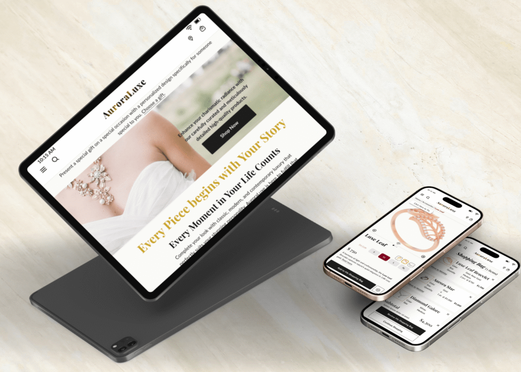
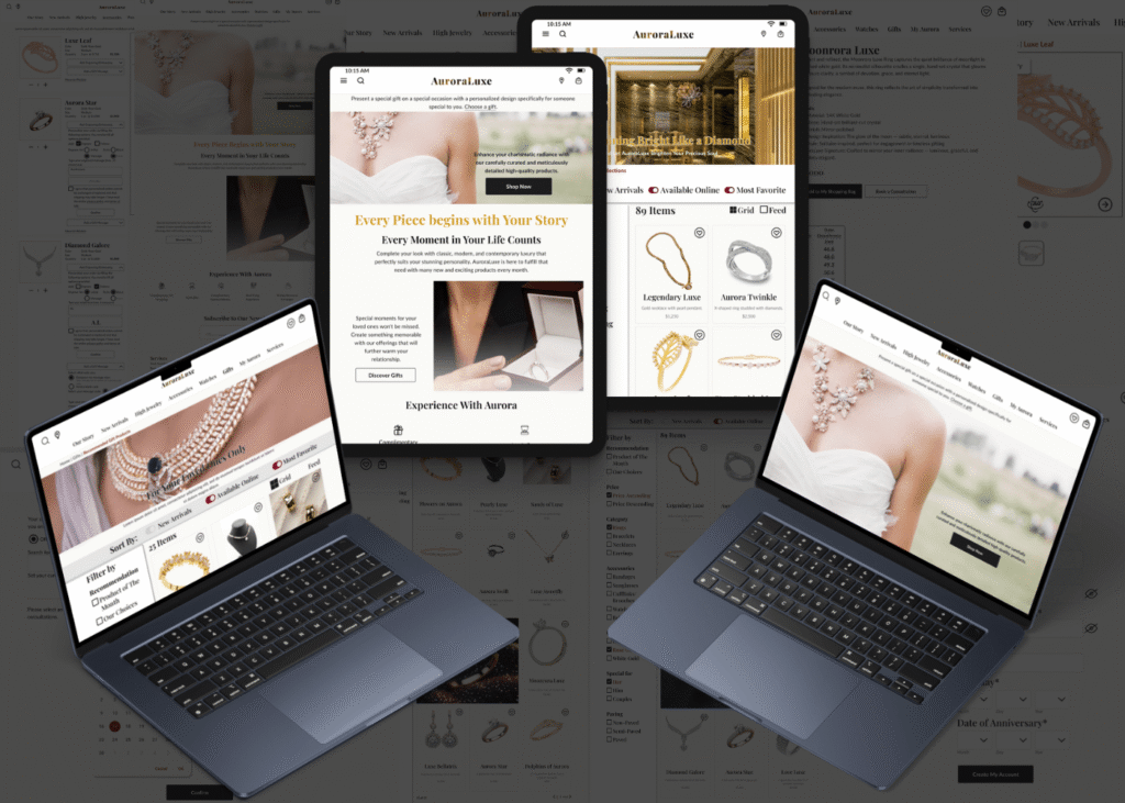
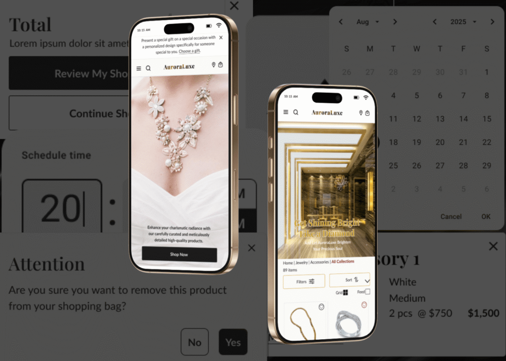
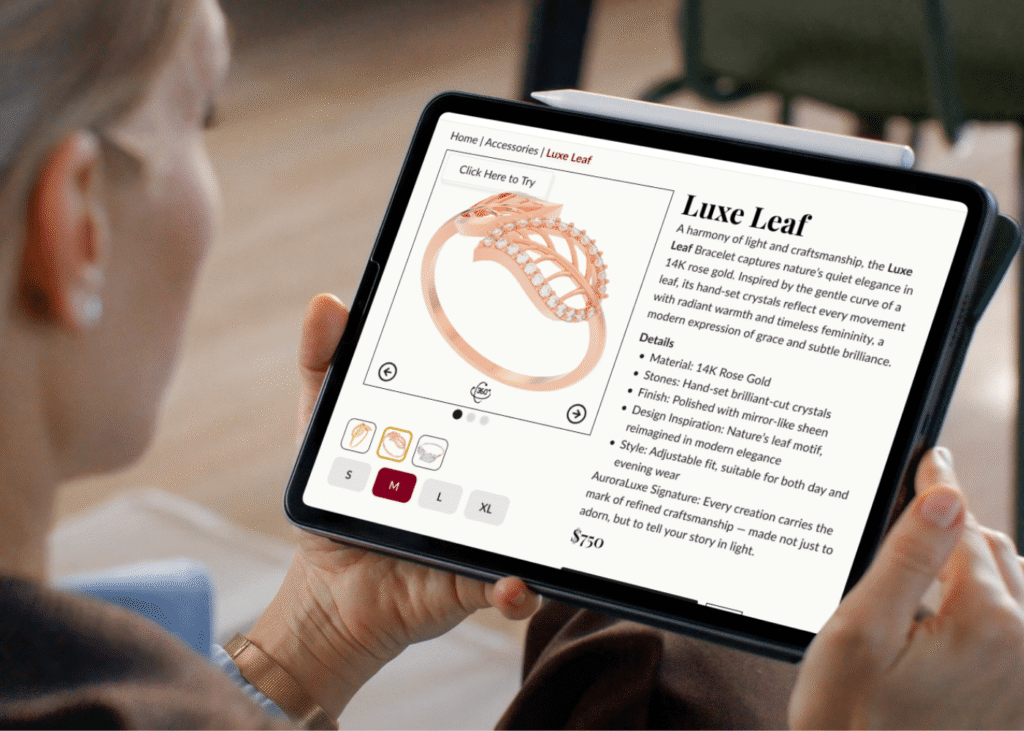
The Designs of Main Pages for AuroraLuxe
The picture above is some design pages for AuroraLuxe. But how are all the designs created? Well, we can see the process in the following section.
The Design Thinking Process
Empathizing
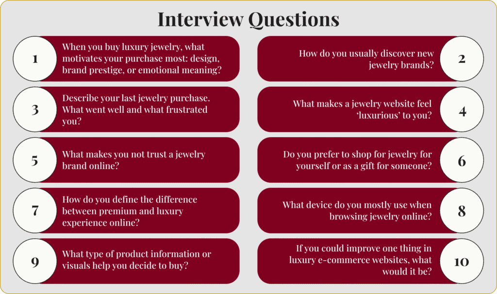
I began with the empathy phase, where I created a design that was not only responsive, enjoyable, and visually captivating but also required a deep understanding of the industry. Through in-depth and detailed analysis of competitors at the same level, as well as conducting surveys and interviews with several respondents who also had an interest in luxury jewelry, I was able to gain a solid foundation before designing.
However, due to time constraints, I didn’t conduct an interview. Therefore, I utilized an AI service, ChatGPT, to help me plan and prepare interview questions, including synthesizing them.
Defining
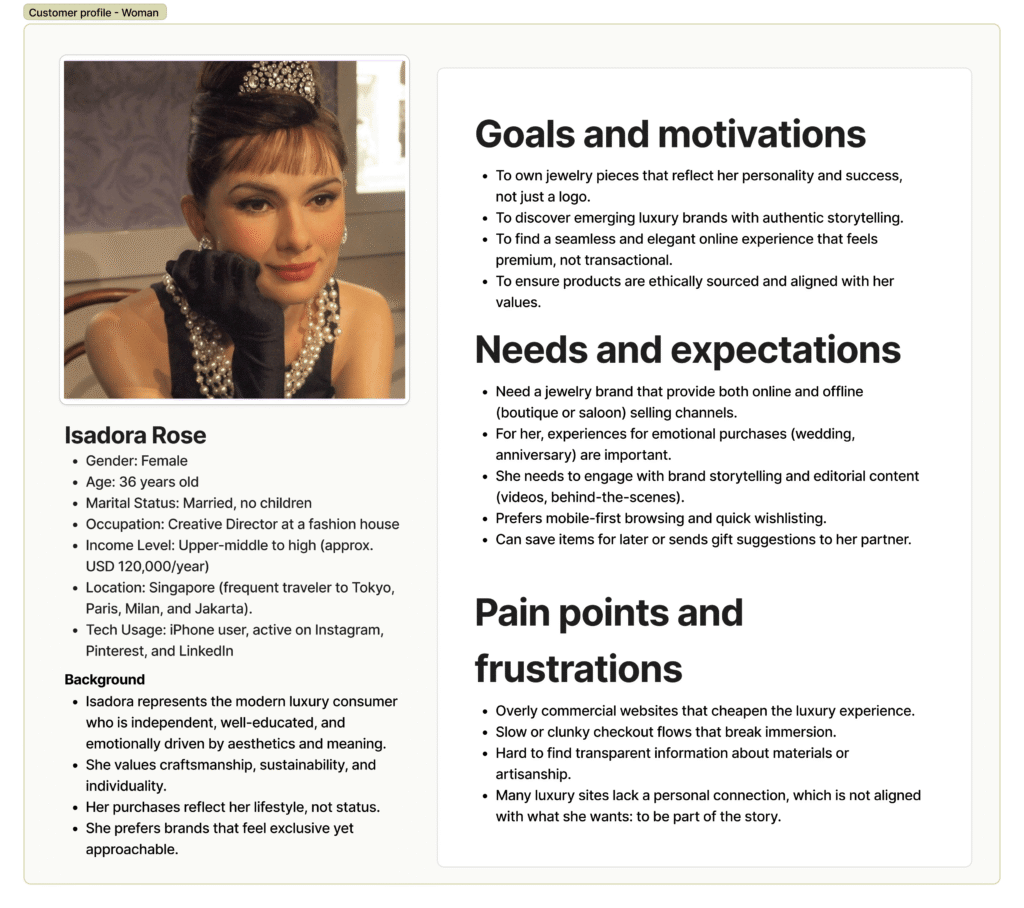
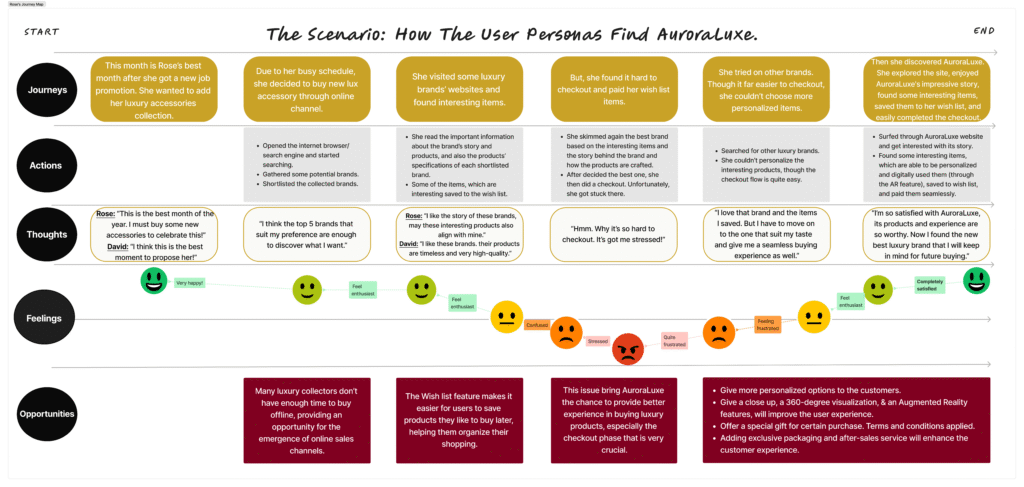
The empathy phase resulted in the creation of two user personas that are extremely relevant to customers of luxury goods such as Aurora Luxe. The first kind, like Isadora Rose, collects costly jewelry to enhance their appearance and prestige and prestige and as a mark of personal achievement.
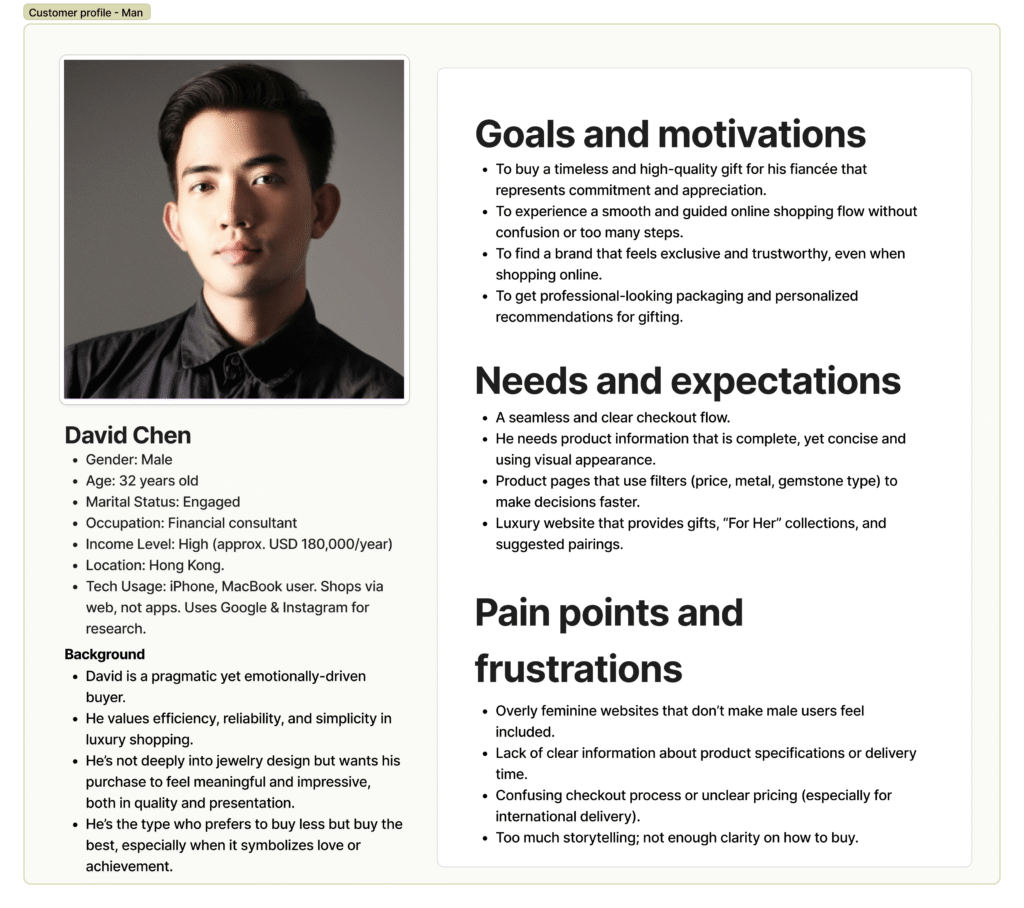
The second category is a customer who appreciates presenting high-end gifts to loved ones on important occasions. David Chen epitomizes the second type, while many women appreciate giving high-end gifts to loved ones.
Next, I describe what the two personas experienced in the customer journey map. I showcased what the users want or need and what their problems or pain points are.
Ideation
Ideation
The pain points depicted in the customer journey map will then serve as the basis for creating a user flow that allows users to enjoy and experience a pleasant experience with various services and ease of shopping on the AuroraLuxe digital store portal due to the clearly designed flow. I created four flows: 1. Search and Purchase Flow 2. Gift Order Flow 3. After-Sales Service Flow 4. Concierge Flow.
However, to save time, I only created designs and prototypes for the product search and purchase flow and gift ordering flow, as these are the two most frequently used by users.
For both flows, I depicted them using low-fidelity and medium-fidelity wireframes.
Product Discovery & Purchase
Order for A Gift
Loyalty or After-Sales Flow
Concierge Flow
⇐
The user flows of AuroraLuxe
Wireframes of AuroraLuxe
⇓
Prototyping
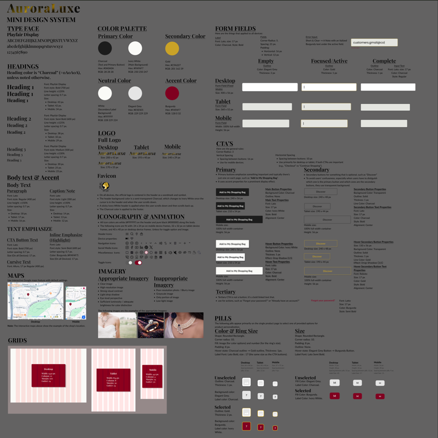
This stage involved establishing interface design fundamentals that ensure consistent design details across all device shapes and sizes, including the creation of all components and variants.
I then began applying these standard patterns, starting with a mood board, then mid-fidelity wireframes, and progressing to high-fidelity wireframes across all device types, resulting in several responsive designs.
I then turned these high-fidelity designs into various mockups and interactive designs through prototyping based on the two user flows I had designed.
⇑
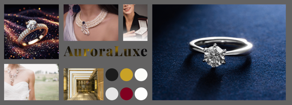
Mood Board for AuroraLuxe
⇐
Responsive page designs
Testing
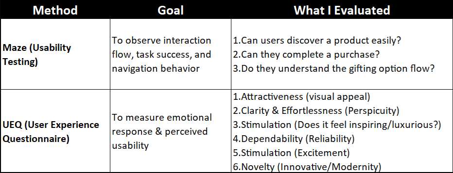
This last phase continues testing high-fidelity designs to examine how excellent the usability level is. I used the two commonly applied usability tests for evaluating design effectiveness:
Interactive prototype testing using Maze to measure interaction flow, task success, and users’ behavior toward the designs.
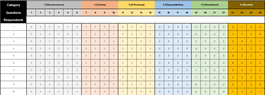
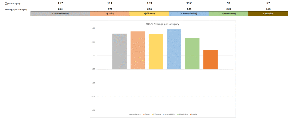
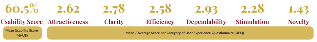
The User Experience Questionnaire (UEQ) is used to measure emotional response and perceived usability.
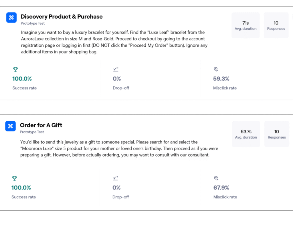
The following images are those included in the interactive prototype testing using Maze:
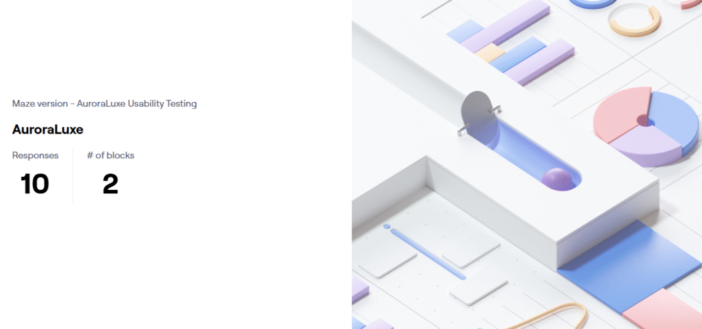
The general report of the interactive prototype testing using Maze stated that the test had ten respondents who ran the two provided missions.
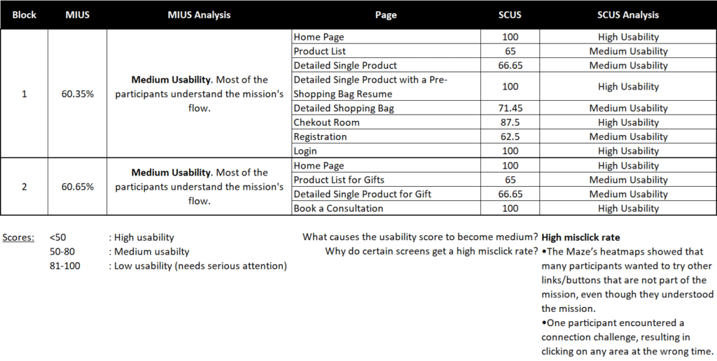
The following table summarizes the results of the interactive prototype testing using Maze:
Meanwhile, some images below are those included in the User Experience Questionnaire (UEQ):
From the two methods of usability testing, here’s the final summary: